00
Remy Folio design system.
An inventory of every style, rule and component this site is built from. Read it before you add a section or a page, and build only from what is here.

For agents
Read this page before you build. Reuse what already exists rather than creating something new.
Don’t add, rename or edit a color style, text style or component on your own. If something is missing, compose it from section 08, or ask before building something new.
Every new section uses the layout in section 04, the in-view appear in section 06 and the voice in section 07.
Protect the signature: the 3D stack of project prints in the Home hero, which brings one forward on hover and carries each into its row in Selected work as you scroll. Never change the row heights.
This page is documentation. Keep it static, with no appear effects.
01
Color guide
Thirteen color styles, each named for its job and each with a light and a dark value. The site follows the visitor’s device setting, so there is no theme switch. Each swatch below is filled with the style itself, so it shows the value for the mode you’re viewing; switch the canvas or your device to dark mode to see the dark values. The template has almost no color of its own: it comes from the work, and the pin green is the only highlight.
For agents
Always use a color style, never a raw hex value. Pick the style and both themes follow.
Primary is the default text color. Use Secondary for labels, years, captions and card summaries. Page leads stay in Primary.
Accent is the one highlight: pins, a statement’s full stop, the wordmark’s dot, outcome lines and the Send button once a message is sent. Never links, buttons, hover, focus or errors; buttons use Primary.
Color styles are named by role, and one color can serve text, fills and lines. Buttons and selected states use Primary, form lines use Secondary, and form focus uses Focus Ring, which stays separate so focus stays easy to see if Primary changes.
Every section sits on the wall. Never give one section its own background.
Roles never change; values can. If the owner changes a value, re-check the contrast table below in both themes.
Background Page
The page background, the gallery wall. Every page and section.
Background Nav
The Nav bar’s see-through background, with a soft blur. It turns solid Background Page on hover.
Background Card
Physical sheets: print frames, the polaroid, service cards and the contact form sheet.
Primary
Headings, body copy and icons, and the Secondary button’s outline.
Secondary
Labels, years, captions, row summaries and footer text.
Inverse
Text and icons on a Primary fill: button labels and the active filter tab.
Accent
The one highlight: pins, a statement’s full stop, the wordmark’s dot, outcome lines and the Send button once a message is sent.
Error
Form error messages and the border of a field in error, always with words.
Border
1 px hairlines: rules, row dividers and filter tab outlines. The rule under a Section Header is 2 px.
Focus Ring
Focus on the form: a field’s 2 px focus underline and the topic chip ring. Links and buttons show the browser’s own focus ring.
Shadow
The only shadow color, used by Shadow.Print and Shadow.Lifted.
Contrast that must survive any change
Primary on Background Page
4.5:1
12.6:1
14.4:1
Secondary on Background Page
4.5:1
4.8:1
6.0:1
Secondary on Background Card
4.5:1
6.4:1
5.2:1
Inverse on Primary
4.5:1
16.7:1
15.1:1
Accent outcome line on Background Page
4.5:1
4.6:1
8.2:1
Error on Background Page
4.5:1
4.5:1
7.6:1
Focus Ring on Background Card
3:1
16.7:1
12.5:1
02
Typography guide
Two Google Fonts families: Instrument Serif for display, Instrument Sans for everything else. Fifteen text styles in four folders, each with its own size at Desktop, Tablet and Phone. Heading holds every heading, named by its job, and each one sets a default level (H1, H2 or H3). Display holds large serif text that isn’t a heading. Body and Label hold paragraph text.
For agents
Apply a text style by name. Never set a font size, weight, letter spacing or line height by hand.
One italic phrase per serif heading, at most, on the words that carry the point. Service Card titles have none.
When a serif statement ends with a full stop, color only that full stop Accent. Section and card titles have no full stop.
Serif styles stay at 400. Sans uses only 400 and 500. No all-caps text anywhere.
Each heading style sets a default level: Hero, Page and 404 Title are H1; Section Title, Section Label and Subhead are H2; Card Title is H3. Section Title also sets case study and post titles (H1) and Project Row titles (H3), with the level set on the layer. Pick the style first, then set the level; changing or re-applying a style resets it. Display, Body and Label styles are paragraphs.
Sizes read desktop / tablet / phone. Keep paragraphs to 680 px wide.
Each specimen below shows its own style name as placeholder copy, so this page still reads correctly after a rebrand.
Heading/404 Title
Instrument Serif
Weight 400 · line height 0.92
170 / 120 / 72 px
The 404 headline only. H1
Heading/Page Title
Instrument Serif
Weight 400 · line height 0.98
100 / 72 / 46 px
Page titles on Work, Contact and Blog. H1. The Contact CTA’s “Write to me.” uses it too, typed as H2
Heading/Hero Title
Instrument Serif
Weight 400 · line height 0.98
84 / 72 / 46 px
The Home hero headline only: a step down from Page Title on desktop, so the 3D stack has room under it. H1
Heading/Section Title
Instrument Serif
Weight 400 · line height 1.0
84 / 64 / 44 px
Large Section Header titles, any section heading without a Section Header, case study and post titles (set to H1) and Project Row titles (set to H3). H2
Heading/Section Label
Instrument Sans
Weight 500 · tracking +1% · line height 1.35
13 / 13 / 13 px
Compact Section Header titles, such as Selected work and All notes. H2
Heading/Subhead
Instrument Serif
Weight 400 · line height 1.0
36 / 32 / 28 px
Subheads in CMS body text, such as blog posts, where they’re Heading 2. H2
Heading/Card Title
Instrument Serif
Weight 400 · line height 1.0
36 / 32 / 28 px
Service, Project and Post Card titles. H3
Display/Statement
Instrument Serif
Weight 400 · line height 1.08
52 / 40 / 30 px
The Home intro, the case study note, the contact email link and form greeting, the phone menu links; balanced wrapping. Paragraph
Display/Stat
Instrument Serif
Weight 400 · line height 0.95
72 / 56 / 44 px
Outcome values. Paragraph
Display/Signature
Instrument Serif
Weight 400 · tracking −1% · line height 1.0
32 / 32 / 30 px
The wordmark (“Remy” in the serif, with an Accent full stop) and the polaroid caption. Paragraph
Body/Body L
Instrument Sans
Weight 400 · line height 1.45
18 / 17 / 17 px
Page leads, the case summary, case chapter text, the 404 sentence
Body/Body
Instrument Sans
Weight 400 · line height 1.45
15 / 15 / 15 px
Body copy, row summaries, card descriptions
Label/Label L
Instrument Sans
Weight 500 · line height 1.2
14 / 14 / 16 px
Navigation, buttons, arrow links, filter tabs and choice chips
Label/Label M
Instrument Sans
Weight 500 · tracking +1% · line height 1.35
13 / 13 / 13 px
Meta labels, years and row labels. Paragraph
Label/Label S
Instrument Sans
Weight 400 · tracking +2% · line height 1.0
11 / 11 / 11 px
Print captions, so long titles fit on phones. Wide Print captions use Label M.
03
Shape and surface
Square is paper; round is the pin and what you press. Depth comes from the paper frame and one soft shadow, and every sheet hangs at a slight tilt.
For agents
Never round a print, card, image or field. Only pins, buttons, filter tabs and choice chips are round.
Rules and dividers are 1 px Border; the Section Header rule is 2 px. Form field underlines and choice chip outlines use Secondary, and a field shows focus as a 2 px Focus Ring underline. Focus Ring stays its own style so focus stays easy to see if Primary changes.
Only prints, service cards, the polaroid and the contact form sheet get a shadow. Never text, buttons, fields, the nav or sections.
Neighboring sheets tilt in opposite directions, never at the same angle. On hover each leans a little further the same way, then settles back.
Stay on the spacing scale, in 4 px steps. 2 px steps are fine only inside small parts such as captions, frames and the Nav bar. No 18 px, no 50 px.
Corner radius
Radius.Paper
0
Prints, covers, images, the polaroid, service cards, form fields, sections
Radius.Round
999 px
Pins, buttons, filter tabs and choice chips
Borders
Border.Hairline
1 px
Rules, row and label-row dividers, filter tab outlines (Border); form field underlines and choice chip outlines (Secondary); a ticked chip and the active or hovered filter tab (Primary); the Secondary button (Primary); a field in error (Error).
Border.Focus
2 px
Focus Ring on the form: a field’s 2 px underline and the topic chip ring. Links and buttons show the browser’s own focus ring
Border.Focus-offset
2 px
The gap between an element and its focus ring
Shadows
At rest
Shadow.Print
Y 4, blur 12, in Shadow
On hover, lifted 6 px
Shadow.Lifted
Y 16, blur 32, in Shadow
Tilt
Tilt.Print
−12° to 12°
Prints on Home stand upright in the hero stack. In their rows they hang at −2°, 2°, −1.5°, 2.5°, −2° (phone −1.5°, 1.5°, −1°, 1.5°, −1°)
Tilt.Card
−2° to 2°
Service Cards: −2°, 1.5°, −1°, 2°
Tilt.Polaroid
−3° or 3°
The portrait polaroid
Wide Print
±0.6° to ±0.75°, pairs ±1.5°
Case study prints at full content width, alternating
Spacing scale
Space.1
4 px
Space.2
8 px
Space.3
12 px
Space.4
16 px
Space.5
20 px
Space.6
24 px
Space.7
28 px
Space.8
32 px
Space.10
40 px
Space.12
48 px
Space.14
56 px
Space.16
64 px
Space.18
72 px
Space.20
80 px
Space.24
96 px
Space.30
120 px
04
Layout and grid
One wall, edge to edge, with content centered at up to 1280 px. A 12-column grid at Desktop, 8 at Tablet and 4 at Phone. Sections stack with no gaps between them; their padding does the spacing.
For agents
Padding lives inside sections. Never add an outside margin or a spacer frame. Every page’s sections sit inside its Main frame (tagged main, so keyboard users can skip the Nav); add new sections inside it.
Put paragraphs in the first 7 columns and keep them to 680 px.
Locked heights stay locked: the Home hero fills the screen, between 760 and 1000 px on Desktop, 720 and 1000 px on Tablet and 720 and 860 px on Phone; and each Selected work row is exactly 300 px on Desktop and 260 px on Tablet (on phones it fits its content). Shorten copy instead.
The Home stack lays itself out in code for 3, 4 or 5 projects (the Hero and Work component’s Projects setting) and finds each print’s row by its layer name, so keep the names Hero text, Selected work and Project · Slot 1 to 5 inside the component, and the Top layer above it.
Phone covers every width below 810 px. Check new layouts at 390 px and at about 700 px, not only at 390.
Card lists on phones use a grid that adds columns when there is room: auto-fill, 240 px minimum, a 20 px column gap and the row gap of the matching desktop section (32 px on Home, 56 px on Work), so two cards sit across from about 540 px. Desktop and Tablet keep fixed column counts.
On phones a Service Card fills its column, and so does the print in a Project Row (Selected work and Next project), up to 480 px, with the row’s text lined up with it. Other prints and cards are at most 300 px: in a single column, center them and let their text run full width underneath.
A Section Header carries a 2 px rule; rows and cards under it use 1 px rules.
Anything a visitor can tap is at least 44 × 44 px, with 8 px between targets.
1
2
3
4
5
6
7
8
9
10
11
12
1
2
3
4
5
6
7
8
1
2
3
4
Page side padding
40
32
20
Content width
1120
746
350
Section padding, top and bottom
96
80
48
Section Header title to its rule
16
16
16
Rule to section content
48
40
32
Columns / gutter
12 / 24
8 / 20
4 / 16
Nav / Footer padding, top and bottom
24 / 24
14 / 24
10 / 24
Home hero height
fills the window, nav over it, 680–800
fills the window, nav over it, 680–800
fills the window, nav over it, 640–700
Selected work row
300
260
fits its content; the print fills the column, up to 480
05
Section patterns
Seventeen section recipes cover the approved pages. Start from the nearest one rather than composing a layout from scratch.
For agents
Start from the nearest pattern and adapt its content. Change its structure only when the content needs it, and ask first.
Content sections usually open with a Section Header, Large or Compact. A section without one titles itself in Heading/Section Title (H2).
Project lists come from the Work collection, never from duplicated rows.
Hero/Stack and Work/Docked-Rows are Home-only. Never copy their motion elsewhere.
When you reuse a Project detail section on a static page, unbind its CMS fields and type real content.
Hero/Stack
Typed statement and role line, centered, above a 3D row of 3, 4 or 5 Project prints, nearest first
On phones the row overlaps more to fit, a tap brings a print forward, and the prints travel into their rows as you scroll, like on desktop
Home only
Work/Docked-Rows
Compact header, then one Project Row per Home slot shown (3, 4 or 5, matching the hero), with docks where the hero prints land
Rows stack on phones, each with its print above its text, as wide as the column (up to 480 px) and lined up with it
Home only
Services/Cards
Large header, then four Service Cards in a row: two by two on tablets narrower than about 1,020 px and on phones 540 px or wider, one column on narrower phones, each card filling its column
2 by 2 on tablet; on phones 2 across from about 540 px, otherwise one column, each card filling its column
Home
About/Lead
Compact header, a Statement intro, the Polaroid and Label Rows
Polaroid moves above the rows on phones
Home
CTA/Write
The Contact CTA component: a centered lead-in, “Write to me.” in Page Title (typed in when half in view), the email in Statement, a Primary Button to the contact form, and the socials
Stays centered; Display steps down per breakpoint
Home, Work and case studies, the same on every page
Case/Hero
Back link, discipline and year, Section Title (set to H1), Body L summary, Client, Role, Scope and Outcome rows
Rows move under the title on phones
Project detail
Case/Chapter
Large header, up to three Body L paragraphs, optional Outcome Stat, then Wide Prints
Pairs stack on phones
Project detail; text sections on new pages
Media/Wide
One 3:2 Wide Print, or a Pair of 4:3 prints
Pairs stack on phones
Project detail
Work/Next
A Compact Section Header with link (“Next project”), then the next project’s Project Row and its Print
As Project Row
Project detail
Contact/Letter
Heading/Page Title statement with an Accent full stop and a Body L lead; Details rows and the Polaroid beside the Contact Form, a Background Card sheet with Field, Choice Chip and Submit Button inside
Details and Polaroid sit above the sheet on tablet; on phones the Polaroid sits centered above the details and the sheet lies flat
Contact
Work/Index
Heading/Page Title statement with an italic phrase and an Accent full stop, a Body L lead, then a row of Filter Tabs
Tabs wrap onto new rows on tablet and phones
Work, Blog
Work/Sheet
Case studies as Project Cards under a Compact Section Header
2 columns on desktop and tablet; on phones case studies go 2 across from about 540 px (one column below that, the print at most 300 px and centered)
Work
Blog/Sheet
Posts as Post Cards under a Compact Section Header, newest first
3 columns on desktop, 2 on tablet; on phones posts go 2 across from about 540 px (one column below that)
Blog
Post/Hero
Back link, then a centered date · topic label, Section Title (set to H1) and Body L summary, with the cover below as a pinned Print
Stays centered; the cover Print narrows to the column on phones
Post
Post/Body
The Body in one 643 px column (Body L paragraphs, Subhead H2s), then a Written by byline: a small Polaroid beside a short bio
One column at every size; on phones the Polaroid sits above the bio
Post
Post/More
A Compact Section Header with link (“All notes”), then three other posts as Post Cards
As Blog/Sheet
Post
Error/Lost
Falling Print, 404 Title statement, one sentence, two Arrow Links
Centered at every size
404
06
Motion and effects
One quiet entrance does almost all the work. The typewriter and the fall play once, and the prints’ trip into Selected work follows the scroll.
For agents
Use the in-view appear on every new section, on its direct content blocks, not every small piece.
Nothing loops. The prints’ trip into Selected work follows the scroll both ways; nothing else replays on scroll. A Service Card draws its art once as it scrolls into view, at every screen size, then keeps it finished; hovering the card doesn’t replay it.
Never add parallax, marquees, custom cursors, motion or decorative blur, 3D flips, bounce or letter-by-letter text outside the two typewriters. The Nav’s background blur and the Home stack’s 3D turn and pointer lean are the exceptions.
With reduced motion on, show every final state straight away.
Appear, in view
Fade in and rise 24 px, 0.6 s, ease out, once. Groups 0.08 s apart, at most 4 steps
Section Headers, rows, cards, label rows, prints. The default for new sections
Appear, on load
The same fade and rise, 0.08 s apart
Hero statements on pages other than Home, Case/Hero
Typewriter
Letters appear one at a time, 50 ms each (Framer’s text effect). Hero: on load. “Write to me.”: when half in view
The Home hero statement, and “Write to me.” in the Contact CTA on every page that has it
Fade in place
Opacity only, 0.6 s, no movement
The role line, the CTA lead-in, email and links
Lift and land
On load, once the statement has typed, the prints fade in with the role line, one at a time, left to right: the first starts as the role line does (2.4 s), then the rest follow 0.12 s apart, 0.6 s each. The stack code plays this fade and takes its timing from the role line’s appear effect, so change it there. A print can’t be hovered or clicked until it has faded in. The prints stand upright in one row turned toward the right corner, about 50° on average, each print adjusted so they all look equally turned, each lying a little over the one before it, so every print’s name stays in view. Hover (after 0.2 s): the prints on top step right, the ones underneath step left, and the print comes to the middle under the heading, quickly then gently (0.95 s), faces front and leans up to 5° toward the pointer as it arrives, with no tilt or lift of its own; one print moves at a time. The trip follows the scroll: as the page scrolls, each print turns to face front and travels into its row, the top print first, landing as the first project row’s middle reaches 55% of the screen height, and it lands with its own slight tilt as its pin pops in. Scrolling back up takes them back. GSAP runs this motion
Home, desktop and tablet: the Project prints in the hero stack
Stack and travel
The row overlaps more and starts at the page margin, so the first print’s name shows and the row runs off the right edge; with five projects it shrinks to fit between the margins instead. A tap brings a print to the middle, a second tap opens the project, and a tap elsewhere sends it back. As the page scrolls, the prints travel into their rows and each pin pops in as its print lands. Scrolling back up returns them
Home, phones
Filter
The chosen tab fills Primary at once; the lists change in place with no animation
Work and Blog: Filter Tabs
Fall
Hangs at −1°; at 2 s it wobbles once (3°, then −2°), then falls out of view in 1.2 s. The pin stays
404 only
Hover
Lift 6 px, lean 1° further the way the sheet already leans (0.5° for a Wide Print), Shadow.Lifted, then settle back to the resting tilt. Spring, about 0.4 s, no bounce. Arrows nudge 4 px. In the hero a print doesn’t lift; it only leans toward the pointer until it lands in Selected work
Every print, card and the polaroid; Arrow Links
Page transition
Cross-fade, 0.3 s, ease out
All pages
07
Voice and tone
Plain, specific and calm, like a good designer talking across a table. First person singular, US English, and the work carries the claim.
For agents
Write in sentence case. Mix short and long sentences: about 8 to 18 words on average.
Never present invented clients, outcomes, prices, quotes or employers as real. Sample content is fine when the owner asks for it; otherwise ask, or leave a placeholder.
No exclamation marks, no emoji, no em dashes, no “passionate about”, “seamless”, “elevate” or “stunning”.
A short question is fine only as the lead-in above the CTA: “Have an idea in mind?”
Hero statement
10 words or fewer, ends with an Accent full stop
Building products with a point of view.
Section Header title
1 to 3 words, one italic word, no full stop
What I do
Lead
First person, one or two sentences
Hi, I’m Remy Varga. I help teams…
Row summary
One line, 60 characters or fewer
Rebuilding onboarding for a Nordic neobank.
Outcome line
A real figure, or a plain fact
Service
One sentence, 20 words or fewer
Logos, type and color systems, and the guidelines that keep a brand consistent.
Link or button
1 to 3 words, verb first
All projects
Placeholder
Capitals in square brackets, until the owner supplies it
[YOUR PRICE]
08
Component list
Twenty-five components cover every repeating element on the approved pages (Hero and Work is Home’s hero and Selected work, with its Projects setting); each is a component in Framer’s Assets panel with the same name, plus Local Time, a code component. Field and Choice Chip, used inside the Contact Form, close the list. Each row shows a light-mode picture of the component next to its rules; the live components are in Framer’s Assets panel.
For agents
Always build from this list. If nothing fits, compose from these components and ask before adding anything.
Don’t edit, rename or restyle a component on your own. Change it through its controls, or ask first.
Where a component has Tablet or Phone variants, set the variant per breakpoint on one instance. Never place one instance per breakpoint. A second copy is fine only when the element moves to a different place on a breakpoint; hide the other copy there.
Bind repeating projects to the Work collection instead of duplicating rows or prints.
Pin
The 12 px Pin disc at the top center of every sheet. Never interactive.
Variants: Default, Small


A Background Card frame, a 4:3 cover and a one-line caption (name · year on the left, arrow on the right), pinned and tilted. Lifts and leans 1° further on hover.
Variants: Project 300 px · Switches: Show pin, Show caption, Show arrow


Wide Print
A Print at full content width on case pages, with a 16 px frame (8 px on phones) and a small tilt.
Variants: Single (3:2), Pair (two 4:3), each with a Phone size


Falling Print
One Project print on the 404. Its variants change after a delay: it hangs, wobbles, then falls out of view. The pin is a separate layer and stays.
Variants: Hanging, Wobble, Wobble back, Falling, Still (reduced motion)


Hanging → Wobble at 2 s → Wobble back → Falling, 1.2 s
Service Card
16:10 art, an upright Heading/Card Title and one Body sentence on Background Card. No number, no expand. The art is the Image, or, with Animated on, one of four drawn animations picked in Animation.
Variants: Default (the art’s start; its width follows the column), Hover (same art) and Played (set as the card scrolls into view; draws the art once)


Polaroid
A 4:5 portrait with a Display/Signature caption (plain text, not a heading), tilted 3°. The portrait may be black and white.
Variants: Tilt left, Tilt right, Small


Nav
The serif wordmark (Remy.), five links, Design system (opens this page on the template’s demo site; remove it before you publish) and, on desktop only, the city with its live Local Time. Fixed to the top: see-through with a soft blur, solid on hover; it slides away as you scroll down and back as you scroll up. Tablet: the wordmark on the left, the links on the right. Phone: a menu icon on the left with the wordmark right after it; the icon opens a full-screen sheet with the links, Design system included, and the email. The menu icon is a button. While the sheet is closed its links are hidden, so they take no keyboard focus, and each row is one link, the full width of the sheet, so a tap anywhere on it opens the page and it’s one Tab stop. Picking a link in the sheet with the keyboard closes the sheet; so do Esc, which puts focus back on the menu button, and tabbing out of the sheet or back past the menu button. After the bar slides away, it slides back when Tab reaches it. Two small overrides from NavKeyboard.tsx do this; test them on the published site.
Variants: Desktop, Tablet, Phone, Phone open


Wordmark
The owner’s name in Display/Signature with an Accent full stop, as in “Remy.” It sits in the Nav on every page, so changing it here changes the whole site. Ask the owner before editing it.
Variants: Default


Local Time
A code component: the live time in one city, in hours and minutes, in Label/Label M Secondary. It sits in the Nav after the city, as in “Based in San Jose · 10:13 p.m.” Set its Time zone to the city beside it, and turn on Seconds to add seconds.
Controls: Time zone, Format, Clock, Seconds (adds seconds; off in the Nav), Font, Color


Footer
The copyright and Back to top. The socials live in Contact CTA.
Variants: Desktop, Tablet, Phone · Switch: Show back to top (off on the 404)


Contact CTA
Closes content pages: a centered lead-in, “Write to me.” in Page Title (typed as h2), the email in Statement, a Primary Button to the contact form and the socials, which wrap onto a second line on narrow phones. Its text shows on every page that uses it, so ask the owner before editing it.
Variants: Default


Button
A verb-first Label/Label L label on a round pill, at least 44 px tall. The Primary button has a Primary fill and Inverse text; the Secondary button has a 1 px Primary outline. The arrow nudges 4 px on hover; no color change.
Variants: Primary, Secondary (hover is built in)


Submit Button
The contact form’s send button. It looks like the Primary button, reads “Sending” while the form posts, then “Message sent” with a check on Accent.
Variants: Default, Hover, Sending, Sent


Arrow Link
A verb-first Label/Label L link. The arrow nudges 4 px in its direction on hover.
Variants: Forward, Back, External


Section Header
Large: a Section Title with one italic word. Compact: a Section Label with a link.
Variants: Large, Compact, Compact with link


Project Row
Title, summary and Accent outcome; discipline and year; and the dock where its print lands. No number. Hovering lifts its print. Bound to the Work collection, one row per Home slot. On phones the dock (Print space) fills the column, up to 480 px, and is shaped like a Print, so the print that lands there fits it exactly.
Variants: Desktop, Tablet, Phone


Label Row
A Label on the left and Body text, a list or a link on the right. Turn off Top rule on the first row in a group.
Variants: Text, List, Link, Highlight, with Phone and Compact sizes


Detail
A Label/Label M in Secondary over Body/Body text, one link or a row of links, with a 1 px Border rule above. Five of them stack beside the contact form.
Variants: Text, Link, Links


Outcome Stat
The figure in Display/Stat Accent and a Body/Body label. It opens the last case chapter.
Variants: Large


Contact Form
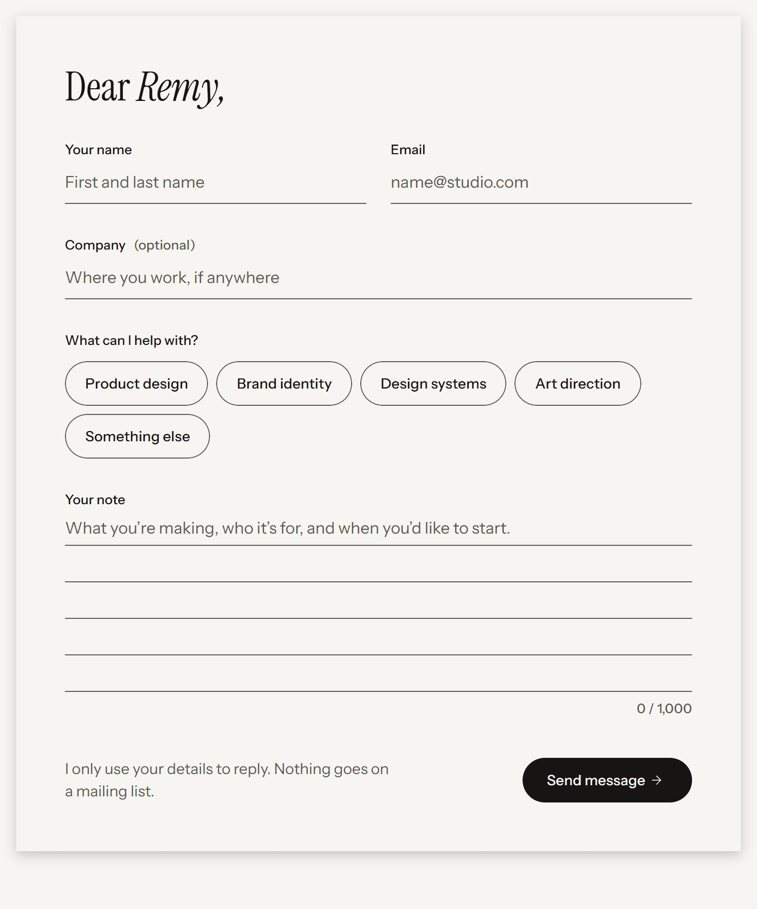
A Background Card letter on the wall (no pin): the “Dear Remy,” salutation, Field and Choice Chip components, the ruled note and the Submit Button. Name, Email and note are required. Labels sit 12 px above what they label; the note grows a ruled line at a time (on phones it stays five lines and scrolls) and shows a character count (1,000 max, set by Max characters). It never lifts, so it stays still while someone types.
Variants: Desktop, Tablet, Phone · On Contact the placed copy is tilted −0.8° (−0.6° on Tablet, flat on Phone). The tilt is set on the copy, not in the component, so set it when you place one.


Filter Tab
A round Label/Label L pill with a 1 px Border border, 44 px tall, in a row above a filterable list. Active: Primary fill and an Inverse label; hover: Primary border. One active at a time, starting with All. No counts. A click sets the page’s filter: Discipline on Work, Topic on Blog.
Variants: Default, Active


Project Card
The Print at full card width (4:3), caption off, then discipline and year in Label/Label M, a Card Title, the Body/Body summary and the Accent outcome. The print and the text below it each link to the case study, since one link can’t sit inside another; hovering lifts the print and leans it 1° further.
Variants: Tilt left (−1°), Tilt right (1°), and Tilt left phone / Tilt right phone for phones


Post Card
The pinned Print at full card width (4:3), caption off, then date and topic in Label/Label M, a Card Title and the Body/Body subtitle. It feeds from the Blog collection, and the print and the text below it each link to the post.
Variants: Tilt left (−1°), Tilt right (1°), and Tilt left phone / Tilt right phone for phones


Parts
Field and Choice Chip are components used inside Contact Form.
Field
A Label/Label M above a Lined input: no box, a 1 px Secondary underline and Body/Body text. Focus is a 2 px Focus Ring underline. Each variant has an error twin (Text error, Email error, Note error): an Error underline, Error rules on the note, and the Field’s Error message in Error under it. Turning Required off adds “(optional)” 8 px after the label, in Secondary. The Note variant is ruled every 36 px and grows a line at a time; on phones it stays five lines and scrolls, with the lines moving along.
Variants: Text, Email, Note, each with an error copy (Text error, Email error, Note error) · Controls: Label, Field name, Placeholder, Required, Max characters, Error message


Choice Chip
A round Label/Label L pill with a 1 px Secondary outline, 44 px tall, for picking one or more options in a form. Selected: a Background Page fill and a 2 px Primary border; the label stays Primary. Keyboard focus adds the 2 px Focus Ring with a 2 px gap, so a selected chip still changes when it’s focused. A click or tap shows no ring; a small override on the chip hides it. The ring itself is the Focus style on the chip’s Checkbox layer, so restyle it there.
Variants: Desktop, Phone · Controls: Label, Group. Selected is the checkbox’s checked state.


09
Images
The owner’s real work on calm, matte grounds in soft daylight. The color comes from the work itself; the template adds the frame, the pin and the shadow.
For agents
Don’t generate images or show an invented project unless the owner asks.
One clear subject per image, shot straight on or as a flat lay. No floating devices, hands holding phones or laptops on desks.
No filters, grading, gradients or baked-in borders and shadows. Only the portrait may be true black and white.
Keep everything important inside the center 80% of the frame, so tilts and crops don’t cut it.
Give every meaningful image one plain sentence of alt text that says what it shows, without repeating its caption. Leave purely decorative images without alt text.


Stand-in sample covers. The owner’s own work replaces them through each project’s Cover image.
Cover image
4:3; the Print crops anything else
2400 px
Case print, single
3:2
2400 px
Case print, pair
4:3 each
2000 px
Service Card art
16:10
1600 px
Portrait
4:5
2000 px
Social image
1200 × 630
1200 px
10
Content model
Two collections. Work powers the Home prints and rows, the Work page and every case study page, with five sample projects in Home slots 1 to 5. Blog powers the Blog page and every post page, with six sample posts. The configuration guide on the User guide canvas page explains every field and option.
For agents
Render projects through a Collection List with the Project Row, Project Card or Print. Never duplicate them by hand.
Home’s hero and Selected work are one component, Hero and Work, with a Projects setting: select it on Home and choose 3, 4 or 5 in the right panel (4 to start). Each Home slot, 1 to 5, holds one project, and slots up to that number show, in the hero and in Selected work. Inside the component the hero has a Print area for each count (Print area · 3, · 4 and · 5) and the setting shows one. On the canvas, each area’s prints use Framer’s own 3D settings (perspective, rotation, skew, scale) to show the stack as Preview draws it for that many projects; in Preview the code replaces them, so leave them as they are. Above the component the page keeps a Top layer, the scroll target for Back to top. The hero fills the window from the top with the nav over it: Home turns off the Main layout’s Space for nav switch, and the hero’s top padding includes the nav’s height (92, 72 and 64 px). The hero stops growing at the height the canvas draws (800, 800 and 700 px), so the canvas, Preview and the live site look the same on any window at least that tall.
Discipline drives the Work filter tabs, one tab per option.
Optional fields hide their print or row when empty. Never fill them with invented content.
Ask to add a field to the collection rather than typing new copy onto a case page.
Work
Title
Plain text
Rows, cards, prints, the case title
Slug
Slug
/work/:slug
Home slot
Option: None, 1–5
Which print in the Home stack and which Home row it fills; the card tilt on Work
Show on 404
Toggle: on or off
Which project falls on the 404 page; with none on, the project in Home slot 1
Year
Number
Rows, cards, case hero; Work sorts by it, newest first
Discipline
Option: Product design, Brand identity, Design systems, Graphic design, Art direction
Rows, cards, case hero, Work filter tabs
Summary
Plain text (keep it to 60 characters)
Row and card line
Case summary
Formatted text: one sentence with one italic phrase
Case study hero lead (Body/Body L), SEO description
Client, Role, Scope
Plain text ×3
Case study Hero label rows
Outcome value
Plain text, optional
Row and card outcome, Outcome Stat
Outcome label
Plain text
Row and card outcome, Outcome Stat
Cover image
Image
The project’s Print on Home, Work and Next project, and the first wide print on its case study
Brief, What I did, What changed
Formatted text ×3
The three Case/Chapters
Print 1–5, Caption 1–5
Image ×5, Plain text ×5
Wide Prints and the chapter 2 pair
Next project
Reference to Work
Work/Next
Social image
Image
Page social preview
Blog
Title
Plain text
Cards, the post title, the search title
Slug
Slug
:slug
Date
Date
Cards and the post label; Blog sorts by it, newest first
Topic
Option: Process, Systems, Craft
Cards, the post label, Blog filter tabs
Summary
Plain text, one sentence
Card line, the post lead, SEO description
Cover image
Image
The pinned Print on cards and the post cover
Body
Formatted text
The post: paragraphs in Body L, subheads (H2) in Subhead
Social image
Image, optional
Page social preview